Gamifying a loyalty and rewards system
Gamifying a loyalty and rewards system
Gamifying a rewards system
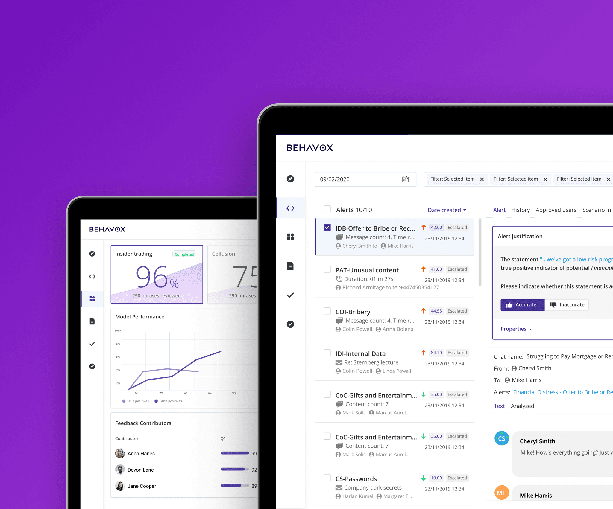
TL;DR: Super’s rewards system was confusing, driving users away. I transformed its UX with gamification. This streamlined navigation, and boosted user activity and retention.
Super.com’s loyalty rewards system was complex causing low user engagement and retention. Users struggled to understand and redeem rewards. This hurt Super's ability to build loyalty. I led a redesign to create a task-based system that improved clarity and engagement.

NBC
+

NBC
+
SUPER
+
NBC
+
TL;DR: Super’s rewards system was confusing, driving users away. I transformed its UX with gamification. This streamlined navigation, and boosted user activity and retention.
35%
Boost in user activity rate
11%
Rise in user account linkings
+5%
Increase in conversions
35%
Boost in user activity rate
11%
Rise in user account linkings
+5%
Increase in conversions
The company
A savings super app
Super is an app that helps users reduce everyday expenses. It offers discounts, cashback, and credit-building tools. The rewards system plays a critical role in user engagement and retention.

The company
A savings super app
Known for travel deals, e-commerce discounts, and fintech services, the app faced a major issue: low usage of its rewards program.
The company
A savings super app
Super is an app that helps users reduce everyday expenses. It offers discounts, cashback, and credit-building tools. The rewards system plays a critical role in user engagement and retention.
The company
A savings super app
Known for travel deals, e-commerce discounts, and fintech services, the app faced a major issue: low usage of its rewards program.


The problem
The problem
A confusing and ineffective rewards system
Many didn’t understand how rewards worked, reducing trust in the system.
Super’s loyalty program overwhelmed users with complexity. This drove disengagement and hurt retention. It affected Super’s ability to foster loyalty.
The problem
A confusing and ineffective rewards system
Many didn’t understand how rewards worked, reducing trust in the system.
Super’s loyalty program overwhelmed users with complexity. This drove disengagement and hurt retention. It affected Super’s ability to foster loyalty.
Many didn’t understand how rewards worked, reducing trust in the system.
Super’s loyalty program overwhelmed users with complexity. This drove disengagement and hurt retention. It affected Super’s ability to foster loyalty.
The challenge
The challenge
How might we…
How might we…
Transform a confusing rewards system into one that is intuitive, engaging, and drives user loyalty and retention?
Transform a confusing rewards system into one that is intuitive, engaging, and drives user loyalty and retention?
Discovery
Research revealed communication gaps and user confusion
Discovery
Research revealed communication gaps and user confusion


Even internally, the legacy system was confusing.
I mapped its structure to uncover weak points and validate assumptions with the team.
I mapped its structure to uncover weak points and validate assumptions with the team.
I started a user survey revealing critical communication gaps:
21%
Didn’t understand how rewards worked
31%
were dissatisfied with the rewards redemption process.
21%
Didn’t understand how rewards worked
31%
were dissatisfied with the rewards redemption process.
A new approach
A new approach
I aimed to simplify rewards with the 'PowerUps' concept
I aimed to simplify rewards with the 'PowerUps' concept
I aimed to simplify rewards with the 'PowerUps' concept
I wanted to streamline rewards with a single, cohesive term to make rewards more intuitive.
I wanted to streamline rewards with a single, cohesive term to make rewards more intuitive.
We tested this new method during the SuperCard onboarding and redesigned the rewards flow.
This new framework attempted to use one term to describe all rewards. We tested it during the SuperCard onboarding, redesigning the rewards flow to make it more intuitive.
We tested this new method during the SuperCard onboarding and redesigned the rewards flow.
We tested this new method during the SuperCard onboarding and redesigned the rewards flow.
We tested this new method during the SuperCard onboarding and redesigned the rewards flow.
1/3
I drew inspiration from products like Hopper’s Carrot Cash, Cash App’s Boosts, and Starbucks’ Stars.

2/3
I created user flows and low-fi mockups for the SuperCash onboarding. These helped us prioritize and shape the MVP.

3/3
Next, I designed a hi-fi onboarding experience. I integrated the PowerUps concept into the flow.
1/3
I drew inspiration from products like Hopper’s Carrot Cash, Cash App’s Boosts, and Starbucks’ Stars.

2/3
I created user flows and low-fi mockups for the SuperCash onboarding. These helped us prioritize and shape the MVP.
3/3
Next, I designed a hi-fi onboarding experience. I integrated the PowerUps concept into the flow.
1/3
I drew inspiration from products like Hopper’s Carrot Cash, Cash App’s Boosts, and Starbucks’ Stars.
2/3
I created user flows and low-fi mockups for the SuperCash onboarding. These helped us prioritize and shape the MVP.
3/3
Next, I designed a hi-fi onboarding experience. I integrated the PowerUps concept into the flow.
Usability testing
Usability testing
Testing revealed the limits of simplification and the need for better tracking
Testing revealed the limits of simplification and the need for better tracking
Testing revealed the limits of simplification and the need for better tracking
Phased rollout: integrating 'Missions' across the Superapp.
Implementation
To maximize engagement, we implemented the new framework across key user touchpoints.
We refined elements of our approach via regular feedback loops. Then, we planned a phased rollout based on feasibility.
1/6
Welcome mission. Set expectations for engagement during onboarding.
2/6
Daily challenge nudges. Encouraged daily interactions and consistent engagement.
3/6
Dedicated missions page. Centralized tasks, providing a sense of progression.
4/6
Instant notifications. Reinforced positive behaviour and motivation.
5/6
Repeated interactions. Sustained engagement throughout the experience.

"I was confused by PowerUps, even if I knew they were beneficial to me."
"I was confused by PowerUps, even if I knew they were beneficial to me."
"I was confused by PowerUps, even if I knew they were beneficial to me."
Testing showed that grouping all rewards under 'PowerUps' added confusion instead of clarity. Users struggled to understand the concept despite its potential benefits.
"When I click to 'Get $20,' I expect to see how long it'll take me to earn it..."
"When I click to 'Get $20,' I expect to see how long it'll take me to earn it..."
"When I click to 'Get $20,' I expect to see how long it'll take me to earn it..."
Users also expressed a need for clear visual cues to track their reward progress. This highlighted a gap in transparency, leaving them unsure of their progress.
A/B test
Introducing visual progress indicators yielded great results
Introducing visual progress indicators yielded great results
We conducted A/B testing on adding a progress tracker in response to user feedback.
We conducted A/B testing on adding a progress tracker in response to user feedback.
A/B testing
Introducing visual progress indicators yielded great results
In response to user's feedback, we A/B tested the addition of a progress indicator.
A/B testing
Introducing visual progress indicators yielded great results
In response to user's feedback, we A/B tested the addition of a progress indicator.
Users responded positively to visual progress indicators. They found them intuitive and motivating.
Users responded positively to visual progress indicators. They found them intuitive and motivating.
Users responded positively to visual progress indicators. They found them intuitive and motivating.
We conducted A/B testing on adding a progress tracker in response to user feedback.
14%+
14%+
14%+
Increase in task completion rates.
Increase in task completion rates.
Workshops
Workshops
I led three workshops to refine direction and clarify priorities
I led three workshops to refine direction and clarify priorities
Test insights drove alignment across the team, ensuring focus and shared goals.
1/3
I included 2 developers and 2 PMs to ensure we addressed both technical and strategic needs. Meanwhile, I kept leadership stakeholders informed.
2/3
We used brainstorming and flow mapping to explore and clarify the MVP’s development plan. This aligned the team and reduced confusion before I began designing.
3/3
We ranked ideas by impact and effort, focusing on quick wins to deliver value. This prioritization ensured we balanced ambitious goals with realistic execution timelines.
1/3
I included 2 developers and 2 PMs to ensure we addressed both technical and strategic needs. Meanwhile, I kept leadership stakeholders informed.
2/3
We used brainstorming and flow mapping to explore and clarify the MVP’s development plan. This aligned the team and reduced confusion before I began designing.
3/3
We ranked ideas by impact and effort, focusing on quick wins to deliver value. This prioritization ensured we balanced ambitious goals with realistic execution timelines.
Strategy shift
Strategy shift
Pivot! The workshops led us to shift our rewards approach.
Pivot! The workshops led us to shift our rewards approach.
Pivot! The workshops led us to shift our rewards approach.
We shifted to a task-based system called ‘Missions.’
We shifted to a task-based system called ‘Missions.’
This new approach motivated users through specific in-app tasks, fostering a sense of accomplishment and clear progress.
We shifted to a task-based system called ‘Missions.’
The "Missions" framework was simple: users completed in-app tasks to earn rewards. It offered a more engaging and holistic way to communicate rewards.
This approach engaged users with clear in-app tasks. It fostered progress and gave them a sense of accomplishment.
"I was eager to complete the mission and claim my reward!"
"I was eager to complete the mission and claim my reward!"
Feedback from testing was very positive. We achieved the clarity and engagement boost we aimed for.
Feedback from testing was very positive. We achieved the clarity and engagement boost we aimed for.
I pitched our new Missions framework to our exec team.
I pitched our new Missions framework to our exec team.
I presented our MVP and phased implementation strategy. This helped me secure full support for the rollout.
Implementation
Phased rollout: integrating 'Missions' across the app.
To maximize engagement, we implemented the new framework across key user touchpoints.
We refined elements of our approach via regular feedback loops. Then, we planned a phased rollout based on feasibility.

1/6
Welcome mission. Set expectations for engagement during onboarding.

2/6
Daily challenge nudges. Encouraged daily interactions and consistent engagement.

3/6
Dedicated missions page. Centralized tasks, providing a sense of progression.
4/6
Instant notifications. Reinforced positive behaviour and motivation.
5/6
Repeated interactions. Sustained engagement throughout the experience.

6/6
Push Notifications. Prompted users to return, supporting retention with incentives.
Impact
Simplified rewards, stronger loyalty.
Simplified rewards, stronger loyalty.
The new framework simplified rewards and strengthened user engagement. As a result, activity and retention improved.
The new framework simplified rewards and strengthened user engagement. As a result, activity and retention improved.
35%
35%
Increase in account linking
Increase in account linking
35%
Increase in account linking
11%
11%
Boost in user activity rate
Boost in user activity rate
11%
Boost in user activity rate
5%
5%
Improvement in conversion rates
Improvement in conversion rates
5%
Improvement in conversion rates
Key learning
Key learning
Simplification isn’t enough. It must come with clarity.
Simplification isn’t enough. It must come with clarity.
User feedback revealed where PowerUps fell short, leading us to create a more intuitive and engaging solution. This reinforced the importance of designing for user understanding.
User feedback revealed where PowerUps fell short, leading us to create a more intuitive and engaging solution. This reinforced the importance of designing for user understanding.
Key learning
Simplification isn’t enough. It must come with clarity.
User feedback revealed where PowerUps fell short, leading us to create a more intuitive and engaging solution. This reinforced the importance of designing for user understanding.
Let’s craft your product’s growth!
Message me
Let’s craft your product’s growth!
Message me
Let’s craft your product’s growth!
Message me
Let’s craft your product’s growth!
Message me
Up next
Up next


Simplified rewards, stronger loyalty.
Impact
The new framework simplified rewards and strengthened user engagement. As a result, activity and retention improved.
35%
Boost in user activity rate
11%
Rise in user account linkings
5%
Increase in conversions
I started a user survey revealing critical communication gaps:
I started a user survey to assess their comprehension. Results were clear:
31%
Expressed dissatisfaction with the redemption process
21%
Didn’t understand how rewards worked
Up next

To maximize engagement, we implemented the new framework across key user touchpoints.
We refined elements of our approach via regular feedback loops. Then, we planned a phased rollout based on feasibility.
Phased rollout: integrating 'Missions' across the app.
Implementation
1/6
Welcome mission. Set expectations for engagement during onboarding.
2/6
Daily challenge nudges. Encouraged daily interactions and consistent engagement.
3/6
Dedicated missions page. Centralized tasks, providing a sense of progression.
4/6
Instant notifications. Reinforced positive behaviour and motivation.
5/6
Repeated interactions. Sustained engagement throughout the experience.
6/6
Push Notifications. Prompted users to return, supporting retention with incentives.
Key learning
Simplification isn’t enough. It must come with clarity.
User feedback revealed where PowerUps fell short, leading us to create a more intuitive and engaging solution. This reinforced the importance of designing for user understanding.
Test insights drove alignment across the team, ensuring focus and shared goals.
Workshops
Collaborative workshops helped us refine our direction
1/3
I included 2 developers and 2 PMs to ensure we addressed both technical and strategic needs. Meanwhile, I kept leadership stakeholders informed.

2/3
We used brainstorming and flow mapping to explore and clarify the MVP’s development plan. This aligned the team and reduced confusion before I began designing.
3/3
We ranked ideas by impact and effort, focusing on quick wins to deliver value. This prioritization ensured we balanced ambitious goals with realistic execution timelines.
Usability testing
Testing revealed the limits of simplification and the need for better tracking
Strategy shift
Pivot! The workshops led us to shift our rewards approach.
We shifted to a task-based system called ‘Missions.’
The "Missions" concept was simple: users completed in-app tasks to earn rewards. It offered a more engaging and holistic way to communicate rewards.
Many didn’t understand how rewards worked, reducing trust in the system.
Super’s loyalty program overwhelmed users with complexity. This drove disengagement and hurt retention. It affected Super’s ability to foster loyalty.
The problem
A confusing and ineffective rewards system
The challenge
How might we…
Transform a confusing rewards system into one that is intuitive, engaging, and drives user loyalty and retention?
I mapped its structure to uncover weak points and validate assumptions with the team.
Even internally, the legacy system was confusing.
Discovery
Research revealed communication gaps and user confusion
21%
Didn’t understand how rewards worked
31%
were dissatisfied with the rewards redemption process.
I started a user survey revealing critical communication gaps:
I started a user survey to assess their comprehension. Results were clear:
Super is an app that helps users reduce everyday expenses. It offers discounts, cashback, and credit-building tools. The rewards system plays a critical role in user engagement and retention.
The company
A savings super app