SUPER
SUPER
SUPER
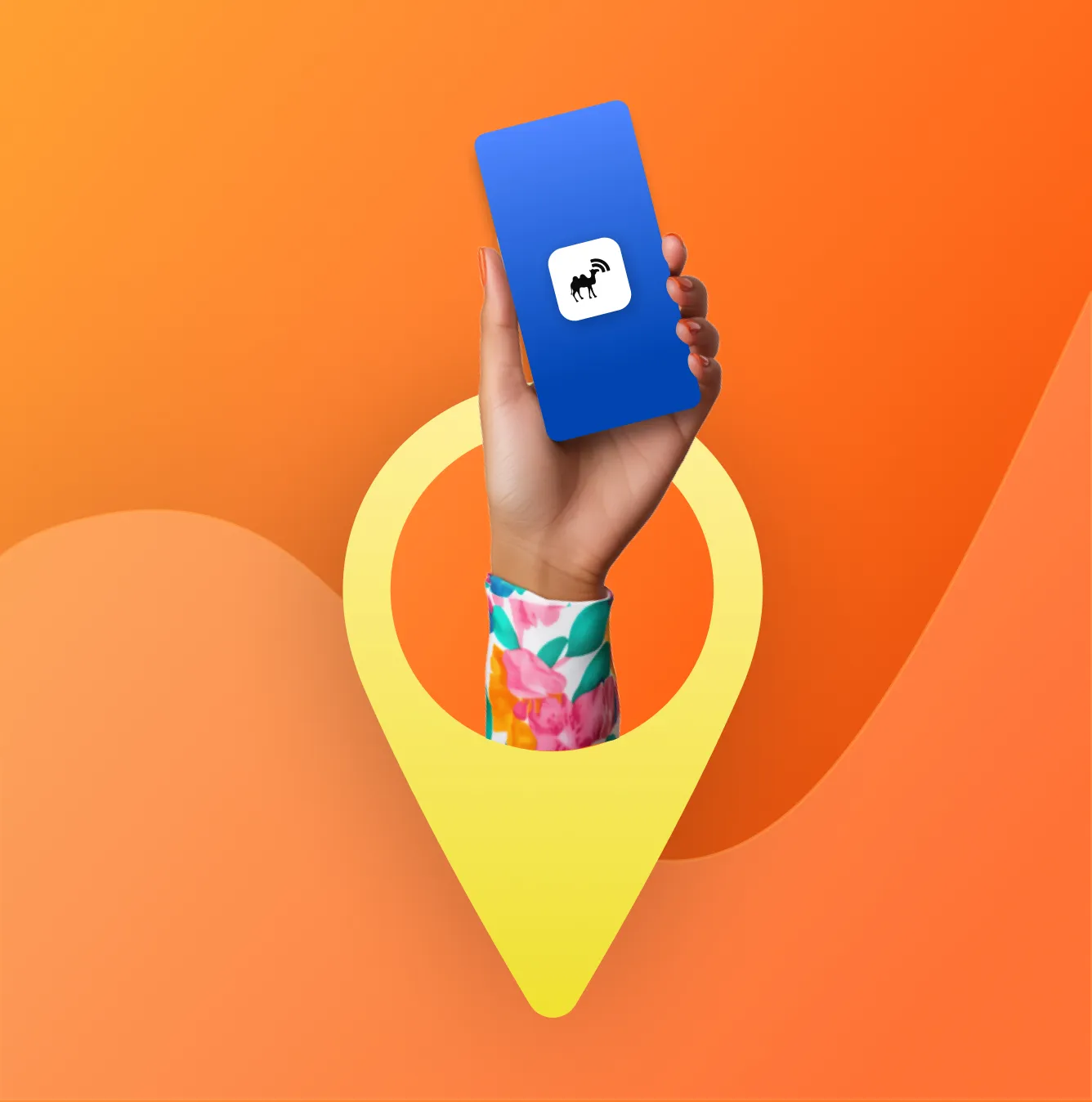
Resolving 6 UX issues in 7 days to improve usability
Resolving 6 UX issues in 7 days to improve usability
SUPER
SUPER
Resolving 6 UX issues in 7 days to improve usability
TL;DR: RTC Nomade’s transit app frustrated users with poor usability. In a 7-day sprint, I redesigned key features laying the groundwork for a modernized user experience.
Super.com’s loyalty rewards system was complex causing low user engagement and retention. Users struggled to understand and redeem rewards. This hurt Super's ability to build loyalty. I led a redesign to create a task-based system that improved clarity and engagement.

NBC
+

NBC
+
SUPER
+
NBC
+
TL;DR: RTC Nomade’s transit app frustrated users with poor usability. In a 7-day sprint, I redesigned key features laying the groundwork for a modernized user experience.
TL;DR: The National Bank of Canada's legacy wealth platform was outdated and difficult to use. This hurt user trust and satisfaction. I redesigned its UX, rebuilding confidence and boosting engagement.
5K
Case study views on Medium.com
2.5K
Impressions on UX Collective
1 year full-time UX design contract

5K
Case study views on Medium.com
2.5K
Impressions on UX Collective
1 year full-time UX design contract
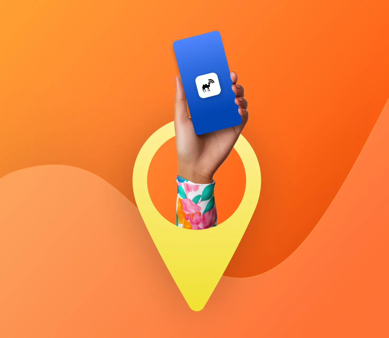
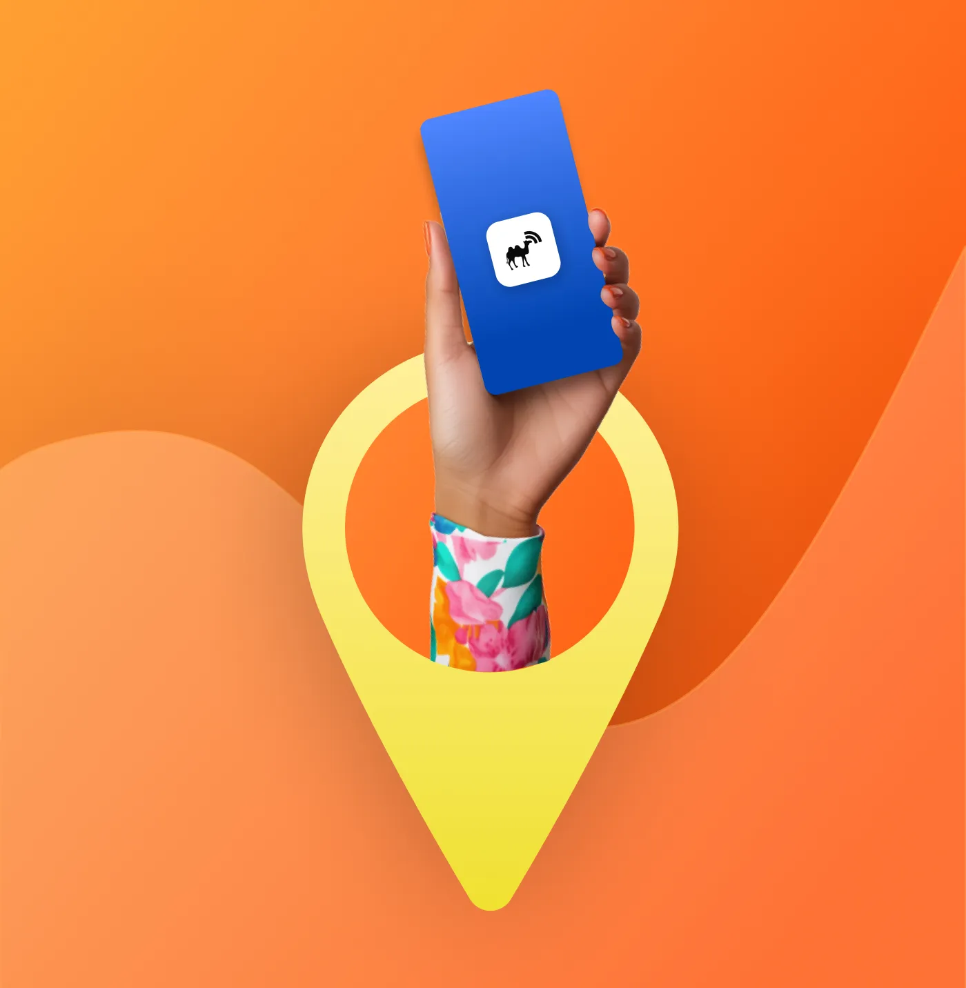
The company
RTC Nomade
RTC Nomade is Quebec City’s official transit app. It helps commuters plan routes, track buses in real-time, and manage daily travel.
The company
RTC Nomade
Known for travel deals, e-commerce discounts, and fintech services, the app faced a major issue: low usage of its rewards program.
The company
RTC Nomade
RTC Nomade is Quebec City’s official transit app. It helps commuters plan routes, track buses in real-time, and manage daily travel.
The company
RTC Nomade
Known for travel deals, e-commerce discounts, and fintech services, the app faced a major issue: low usage of its rewards program.


The problem
The problem
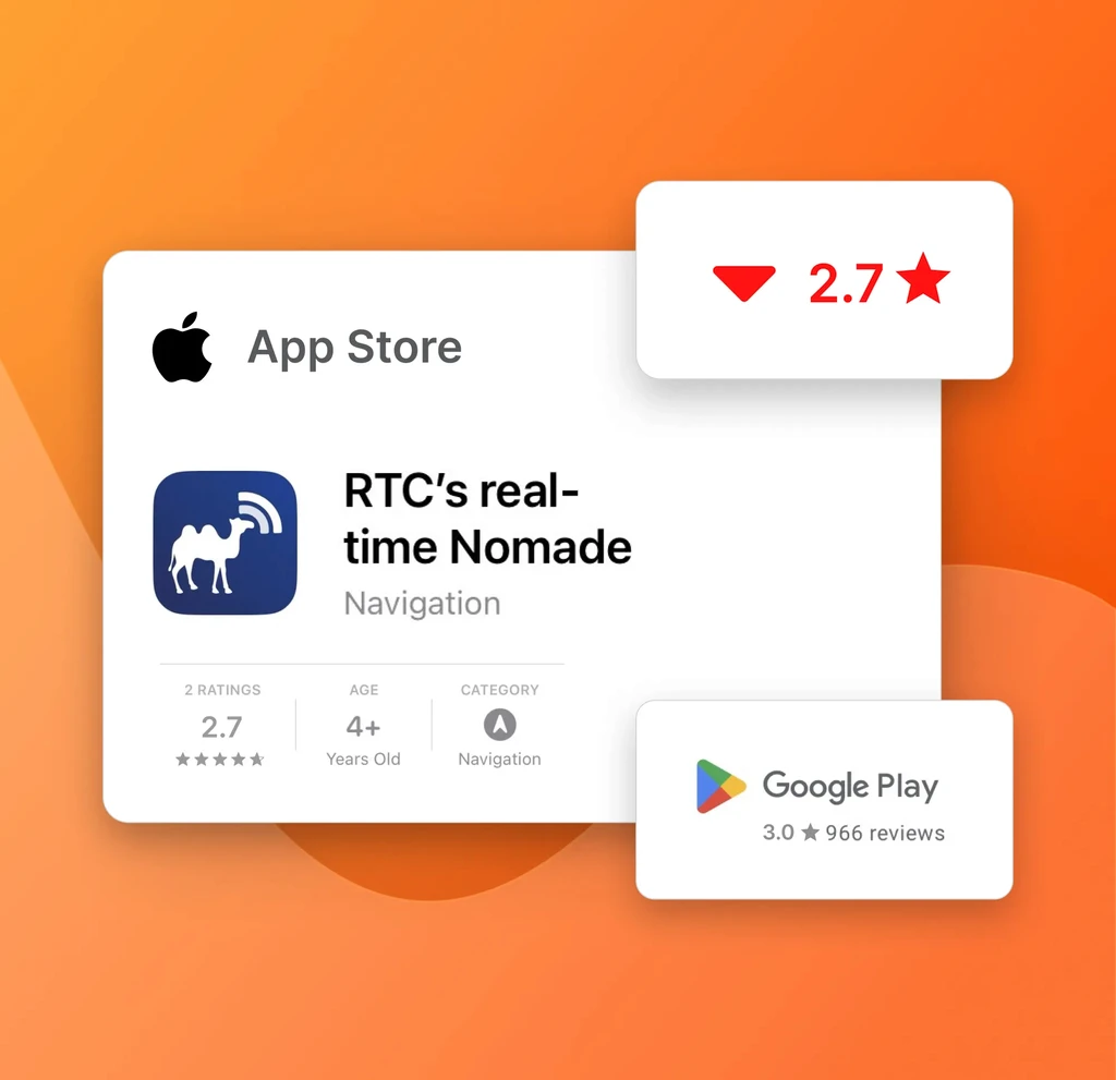
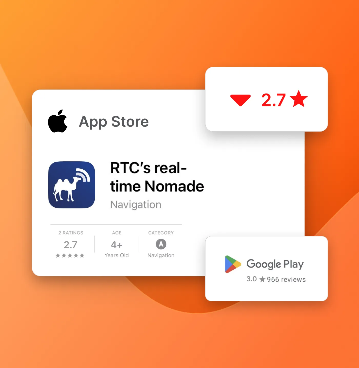
A frustrating app failing commuters
Low app store ratings and user complaints highlighted the app’s unintuitive design.
This left commuters frustrated and without a reliable tool for their daily travel needs.
The problem
A frustrating app failing commuters
Low app store ratings and user complaints highlighted the app’s unintuitive design.
This left commuters frustrated and without a reliable tool for their daily travel needs.
Low app store ratings and user complaints highlighted the app’s unintuitive design.
This left commuters frustrated and without a reliable tool for their daily travel needs.
The challenge
The challenge
How might I…
How might I…
Quickly craft a proposal to enhance RTC's usability and improve commuter satisfaction?
Quickly craft a proposal to enhance RTC's usability and improve commuter satisfaction?
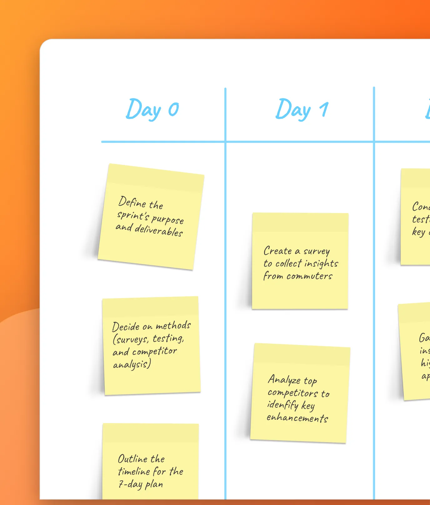
Day 0
Day 0
Setting objectives for a successful Sprint
Given the tight timeline, I focused on solving the app’s most critical usability issues in 7-days.
My plan included surveying users, conducting a usability test, and analyzing competitors. Inspired by Google Maps, I also wanted to assess users' interest in providing feedback.
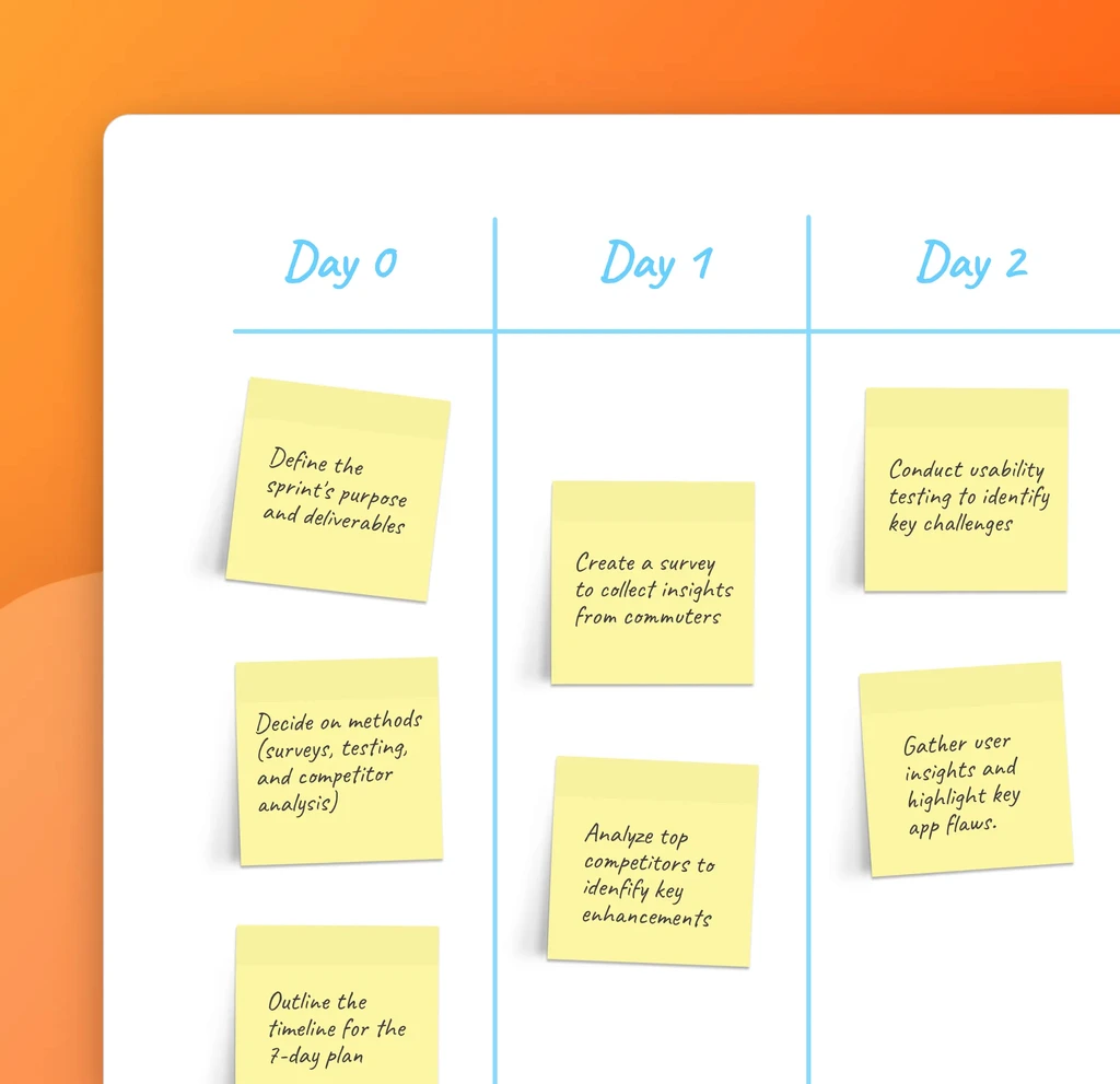
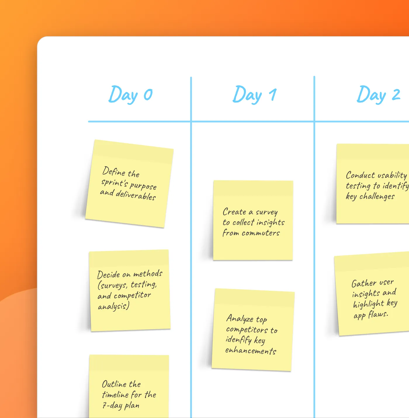

Given the tight timeline, I focused on solving the app’s most critical usability issues in 7-days.
My plan included surveying users, conducting a usability test, and analyzing competitors. I also wanted to assess users' interest in providing feedback, inspired by Google Maps.
Day 1
Understanding commuter pain points and market gaps
Day 1
Understanding commuter pains and market gaps

I created a commuters survey to understand their frustrations
I created a survey for 15 commuters, both frequent and infrequent users. Their feedback highlighted challenges with the app’s usability and navigation.
I created a survey for 15 commuters, both frequent and infrequent users. Their feedback highlighted challenges with the app’s usability and navigation.
Competitor analysis pinpointed key areas for improvement
Benchmarking revealed key areas where the transit app lagged behind competitors. Improving navigation and onboarding emerged as top priorities.
Benchmarking revealed key areas where the transit app lagged behind competitors. Improving navigation and onboarding emerged as top priorities.
Day 2
Uncovering usability gaps with guerilla testing
Uncovering usability gaps with guerilla testing
I tested the app with 6 users, including students and friends.
I tested the app with 6 users, including students and friends.
I tested key tasks like creating itineraries and finding bus lines. Testing uncovered pain points for existing users and onboarding challenges for new ones.
I tested key tasks like creating itineraries and finding bus lines. Testing uncovered pain points for existing users and onboarding challenges for new ones.
Day 3
Identifying critical pain points to refine focus
Identifying critical pain points to refine focus
My testing notes uncovered 4 recurring user frustrations. These aligned with competitor analysis findings and sharpened my focus.
Testing notes revealed 4 recurring user frustrations. These aligned with competitor analysis findings and sharpened my focus.
Overwhelming onboarding. Excessive permission requests left users frustrated and disengaged early in the process.
Overwhelming onboarding. Excessive permission requests left users frustrated and disengaged early in the process.
Cluttered navigation. Essential functions were buried under too many menus, slowing down task completion.
Cluttered navigation. Essential functions were buried under too many menus, slowing down task completion.
Confusing notifications. Irrelevant alerts made it difficult for users to focus on important updates.
Confusing notifications. Irrelevant alerts made it difficult for users to focus on important updates.
Frustrating bus line details. Opposite bus line details required unnecessary scrolling, disrupting the user journey.
Frustrating bus line details. Opposite bus line details required unnecessary scrolling, disrupting the user journey.
Validating user interest in giving trip feedback
Validating user interest in giving trip feedback
Validating user interest in giving trip feedback
On top of usability issues, survey results confirmed users' interest in a trip feedback feature.
On top of usability issues, survey results confirmed users' interest in a trip feedback feature.
Over 56% of participants expressed a desire to share trip feedback. This insight led me to prioritize adding trip feedback functionality to boost user engagement.
Over 56% of participants expressed a desire to share trip feedback. This insight led me to prioritize adding trip feedback functionality to boost user engagement.
Over 56% of participants expressed a desire to share trip feedback. This insight led me to prioritize adding trip feedback functionality to boost user engagement.
Day 4
Day 4
Simplifying user flows to reduce app friction
Simplifying user flows to reduce app friction
Simplifying flows to reduce app friction
To tackle the app’s core usability issues, I began rethinking its user flows.
To tackle the app’s core usability issues, I began rethinking its user flows.
My goal was to simplify essential tasks, like creating itineraries and navigating bus lines. I aimed to eliminate unnecessary steps and minimized user friction.
My goal was to simplify essential tasks, like creating itineraries and navigating bus lines. I aimed to eliminate unnecessary steps and minimized user friction.
My goal was to simplify essential tasks, like creating itineraries and navigating bus lines. I aimed to eliminate unnecessary steps and minimized user friction.
Day 5 to 7
Day 5 to 7
Quickly prototyping solutions to fix key usability issues
Quickly prototyping solutions to fix key usability issues
Quickly prototyping solutions to fix key usability issues
Enhancing onboarding for a smoother start
Enhancing onboarding for a smoother start
Enhancing onboarding for a smoother start
NBC
+
NBC
+
NBC
+
Before: The app’s onboarding burdened users with excessive permission requests, most of which they ignored. This caused frustration and disengagement.
Before: The app’s onboarding burdened users with excessive permission requests, most of which they ignored. This caused frustration and disengagement.
Before: The app’s onboarding burdened users with excessive permission requests, most of which they ignored. This caused frustration and disengagement.
NBC
+
NBC
+
NBC
+
After: I moved the permission requests to the end of onboarding. This let users first experience the app’s value before being asked for permissions.
After: I moved the permission requests to the end of onboarding. This let users first experience the app’s value before being asked for permissions.
After: I moved the permission requests to the end of onboarding. This let users first experience the app’s value before being asked for permissions.
Simplifying the homepage for better navigation
Simplifying the homepage for better navigation
Simplifying the homepage for better navigation
NBC
+
NBC
+
NBC
+
Before: The homepage was too complex. Navigation options were hard to reach, with too many menu items. Users struggled to find what they needed.
Before: The homepage was too complex. Navigation options were hard to reach, with too many menu items. Users struggled to find what they needed.
Before: The homepage was too complex. Navigation options were hard to reach, with too many menu items. Users struggled to find what they needed.
NBC
+
NBC
+
NBC
+
After: I streamlined the app's navigation to improve usability. Essential elements, like bus lines, search, and favourites, were displayed prominently.
After: I streamlined the app's navigation to improve usability. Essential elements, like bus lines, search, and favourites, were displayed prominently.
After: I streamlined the app's navigation to improve usability. Essential elements, like bus lines, search, and favourites, were displayed prominently.
Fixing bus line navigation for easier access
Fixing bus line navigation for easier access
Fixing bus line navigation for easier access
NBC
+
NBC
+
NBC
+
Before: Users struggled to find information about opposite bus directions. This required extensive scrolling and caused frustration.
Before: Users struggled to find information about opposite bus directions. This required extensive scrolling and caused frustration.
Before: Users struggled to find information about opposite bus directions. This required extensive scrolling and caused frustration.
Before: Bus line disruption notifications were excessive and cluttered. This created visual noise and made the alerts hard to read.
NBC
+
NBC
+
NBC
+
After: I combined both directions under a single tab. This solution eliminated unnecessary scrolling and made the information easier to access.
After: I combined both directions under a single tab. This solution eliminated unnecessary scrolling and made the information easier to access.
After: I combined both directions under a single tab. This solution eliminated unnecessary scrolling and made the information easier to access.
After: I oped for personalized push notifications to reduce unnecessary alerts. I restructured the information to make it clearer and more accessible.
Improving bus line disruption notifications for clarity
Improving bus line disruption notifications for clarity
Improving bus line disruption notifications for clarity
NBC
+
NBC
+
NBC
+
Before: Bus line disruption notifications were excessive and cluttered. This created visual noise and made the alerts hard to read.
Before: Bus line disruption notifications were excessive and cluttered. This created visual noise and made the alerts hard to read.
Before: Bus line disruption notifications were excessive and cluttered. This created visual noise and made the alerts hard to read.
NBC
+
NBC
+
NBC
+
After: I opted for personalized push notifications to reduce unnecessary alerts. I reorganized the information to improve clarity and accessibility.
After: I opted for personalized push notifications to reduce unnecessary alerts. I reorganized the information to improve clarity and accessibility.
After: I opted for personalized push notifications to reduce unnecessary alerts. I reorganized the information to improve clarity and accessibility.
NBC
+
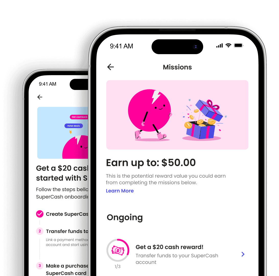
Adding post-trip feedback capabilities to engage users
Flagging brand discrepancies to prevent user confusion
I created a feedback system for users to share their transit experiences after trips.
The app's logo differed between the App Store, buses, and bus stops.
This could confuse tourists or new users trying to locate the app. I wanted to flag this issue in my proposal. Fixing this would improve app discoverability.
The feature allowed users to provide valuable insights after each trip. this would boost engagement and enhance the app's usability.
The app's logo differed between the App Store, buses, and bus stops.
This could confuse tourists or new users trying to locate the app. I wanted to flag this issue in my proposal. Fixing this would improve app discoverability.
Flagging brand discrepancies to prevent user confusion
To gather early insights, I presented the designs to 4 advisors and 6 key NBC stakeholders. I used a low-fidelity prototype to gather actionable feedback, guiding my upcoming refinements.
Flagging brand discrepancies to prevent user confusion
Adding post-trip feedback capabilities to engage users
The app's logo differed between the App Store, buses, and bus stops.
I created a system for users to share their transit experiences after each trip.
The feature allowed users to provide valuable insights after each trip. this would boost engagement and enhance the app's usability.
This could confuse tourists or new users trying to locate the app. I wanted to flag this issue in my proposal. Fixing this would improve app discoverability.
I created a system for users to share their transit experiences after each trip.
The feature allowed users to provide valuable insights after each trip. this would boost engagement and enhance the app's usability.
NBC
+
NBC
+
NBC
+
Adding post-trip feedback capabilities to engage users
To gather early insights, I presented the designs to 4 advisors and 6 key NBC stakeholders. I used a low-fidelity prototype to gather actionable feedback, guiding my upcoming refinements.
Handoff
Handoff
Delivering a detailed UX improvement plan
Delivering a detailed UX improvement plan
Delivering a detailed UX improvement proposal
After completing my work, I presented a detailed proposal to the Libeo team.
After completing my work, I presented a detailed proposal to the Libeo team.
After completing my work, I presented a comprehensive proposal to the Libeo team.
It solved usability problems and suggested two features: in-app ticketing and a news page. Both were informed by user feedback to align with commuter needs.
It solved usability problems and suggested two features: in-app ticketing and a news page. Both were informed by user feedback to align with commuter needs.
Handoff
Delivering a comprehensive UX/UI proposal to address usability needs
After completing my work, I presented a detailed plan to the Libeo team.
It solved usability problems and suggested two features: in-app ticketing and a news page. Both were informed by user feedback to align with commuter needs.
Impact
Insights shared, opportunities gained
Insights shared, opportunities gained
Relocation and no remote work options meant I couldn’t work with Libeo. Still, sharing my work online gained traction and boosted my career growth.
Relocation and no remote work options meant I couldn’t work with Libeo. Still, sharing my work online gained traction and boosted my career growth.
5K
5K
Case study views on Medium
Case study views on Medium
2.5K
2.5K
Impressions on UX Collective
Impressions on UX Collective
One-year full-time design contract with Valtech a global design agency
One-year full-time design contract with Valtech, a global design agency
One-year full-time design contract with Valtech a global design agency
Key learning
Key learning
Prioritizing user needs to beat tight deadlines
Prioritizing user needs to beat tight deadlines
The 7-day sprint taught me to balance speed and quality by focusing on user needs. Prioritizing the most critical issues allowed me to deliver impactful solutions under pressure.
The 7-day sprint taught me to balance speed and quality by focusing on user needs. Prioritizing the most critical issues allowed me to deliver impactful solutions under pressure.
Key learning
Prioritizing user needs to beat tight deadlines
The 7-day sprint taught me to balance speed and quality by focusing on user needs. Prioritizing the most critical issues allowed me to deliver impactful solutions under pressure.
Wanna hear the full story?
Email me
Email me
Up next
Up next


Turning a proposal into career opportunities
Impact
Relocation and no remote work options meant I couldn’t work with Libeo. Still, sharing my work online gained traction and boosted my career growth.
5K
Case study views on Medium
2.5K
Impressions on UX Collective
Full-time design contract with Valtech, a global design agency
(All metrics achieved within a 1-month timeframe.)
Up next

Key learning
Prioritizing user needs to beat tight deadlines
The 7-day sprint taught me to balance speed and quality by focusing on user needs. Prioritizing the most critical issues allowed me to deliver impactful solutions under pressure.
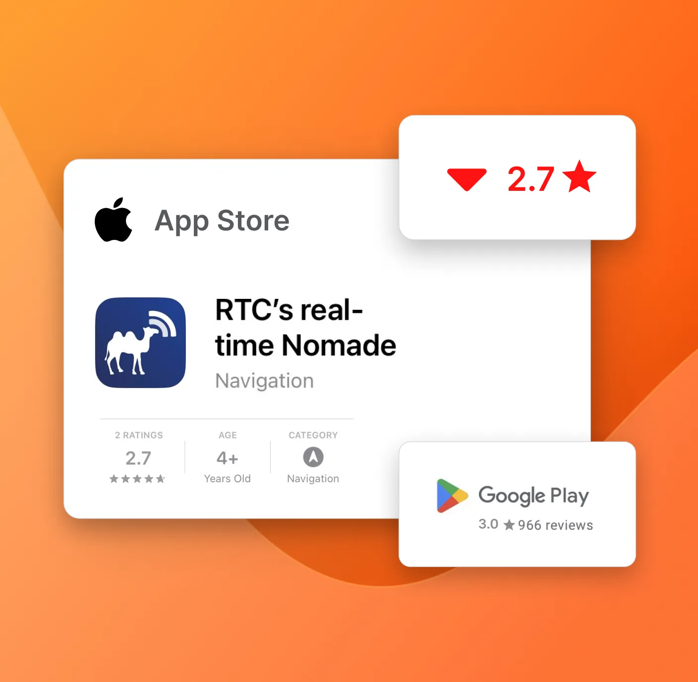
Low app store ratings and user complaints revealed the app’s lack of intuitiveness.
This left commuters frustrated and without a reliable tool for their daily travel needs.
The problem
A frustrating app failing commuters
The challenge
How might we…
Quickly craft a proposal to enhance RTC's usability and improve commuter satisfaction?
RTC Nomade is Quebec City’s official transit app. It helps commuters plan routes, track buses in real-time, and manage daily travel.
The company
RTC Nomade
Discovery
Understanding commuter pain points and market gaps
I worked with the content strategist to interview 9 financial advisors, uncovering key issues:
I created a commuters survey to understand their frustrations
I created a survey for 15 commuters, both frequent and infrequent users. Their feedback highlighted challenges with the app’s usability and navigation.
Competitor analysis revealed key areas for improvement
Benchmarking revealed key areas where the transit app lagged behind competitors. Improving navigation and onboarding emerged as top priorities.
Day 2
Finding usability gaps with guerilla testing
I tested the app with 6 users, including students and friends.
I tested key tasks like creating itineraries and finding bus lines. Testing uncovered pain points for existing users and onboarding challenges for new ones.
Validating user interest in giving trip feedback
On top of usability issues, survey results confirmed users' interest in a trip feedback feature.
Over 56% of participants expressed a desire to share trip feedback. This insight led me to prioritize adding trip feedback functionality to boost user engagement.
Day 3
Identifying critical pain points to refine focus
My testing notes uncovered 4 recurring user frustrations.
These aligned with competitor analysis findings and sharpened my focus.
Overwhelming onboarding. Excessive permission requests frustrated users and disengaged early in the process.
Cluttered navigation. key functions were buried under too many menus, slowing down task completion.
Confusing Notifications. Irrelevant alerts made it difficult for users to focus on important updates.
Frustrating Bus Line Details. Opposite bus line details required unnecessary scrolling, disrupting the user journey.
Day 0
Setting objectives for a successful Sprint
Given the tight timeline, I focused on solving the most critical issues in 7-days.
My plan included surveying users, conducting a usability test, and analyzing competitors. I also wanted to assess users' interest in providing feedback, inspired by Google Maps.
Day 4
Simplifying user flows to reduce app friction
To tackle the app’s core usability issues, I began rethinking its user flows.
My goal was to simplify essential tasks, like creating itineraries and navigating bus lines. I aimed to eliminate unnecessary steps and minimized user friction.
Day 5 to 7