Revamping a wealth management site
Revamping a wealth management site
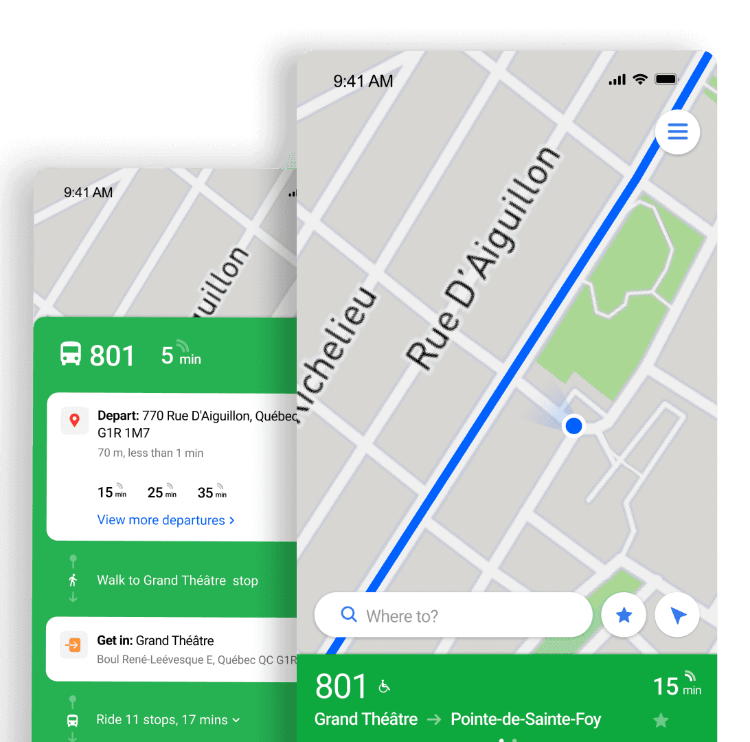
Revamping an investment site
TL;DR: The National Bank of Canada's legacy wealth platform was outdated and difficult to use. I redesigned the UX to improve usability, rebuild trust, and strengthen advisor engagement.
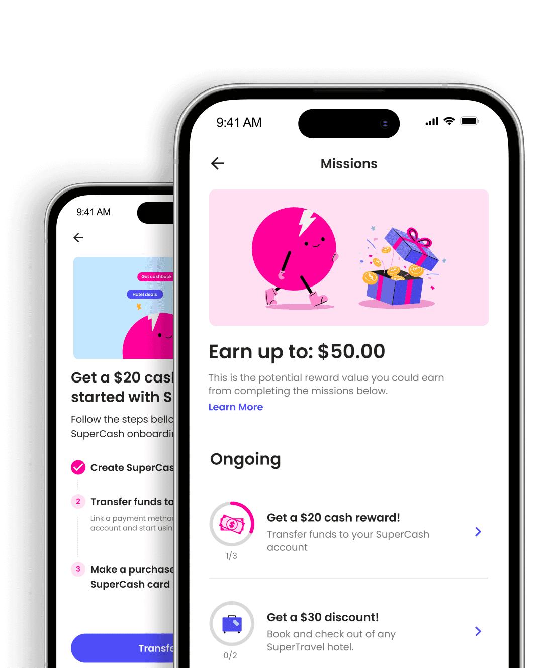
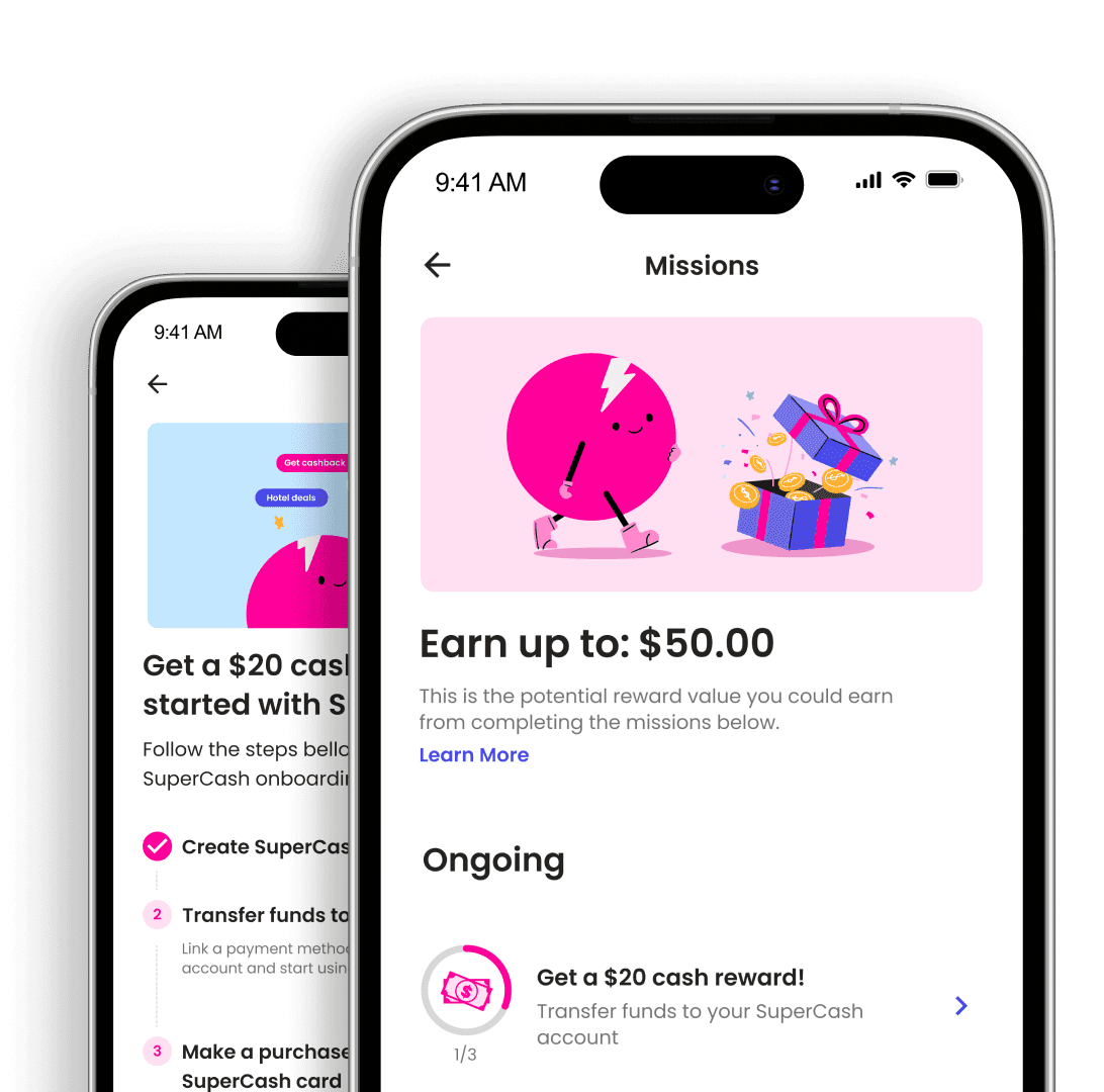
Super.com’s loyalty rewards system was complex causing low user engagement and retention. Users struggled to understand and redeem rewards. This hurt Super's ability to build loyalty. I led a redesign to create a task-based system that improved clarity and engagement.

NBC
+

NBC
+
SUPER
+
NBC
+
TL;DR: The National Bank of Canada's legacy wealth platform was outdated and difficult to use. I redesigned the UX to improve usability, rebuild trust, and strengthen advisor engagement.
TL;DR: The National Bank of Canada's legacy wealth platform was outdated and difficult to use. This hurt user trust and satisfaction. I redesigned its UX, rebuilding confidence and boosting engagement.
78%
Growth in user satisfaction
6.25%
Increase in advisor talent
Boost in advisor profile visibility

78%
Growth in user satisfaction
6.25%
Increase in advisor talent
Boost in advisor profile visibility
The company
National Bank of Canada
The National Bank of Canada (NBC) operates the 5th largest wealth management platform in Canada. It connects affluent clients with a network of over 800 financial advisors.

The company
National Bank of Canada
Known for travel deals, e-commerce discounts, and fintech services, the app faced a major issue: low usage of its rewards program.
The company
National Bank of Canada
The National Bank of Canada (NBC) operates the 5th largest wealth management platform in Canada. It connects affluent clients with a network of over 800 financial advisors.
The company
National Bank of Canada
Known for travel deals, e-commerce discounts, and fintech services, the app faced a major issue: low usage of its rewards program.


The problem
The problem
A legacy platform failing its advisors
Outdated design and poor usability hindered advisors from supporting clients efficiently.
This led to lost talent and eroded trust in the platform.
The problem
A legacy platform failing its advisors
Outdated design and poor usability hindered advisors from supporting clients efficiently.
This led to lost talent and eroded trust in the platform.
Outdated design and poor usability hindered advisors from supporting clients efficiently.
This led to lost talent and eroded trust in the platform.
The challenge
The challenge
How might we…
How might we…
Rebuild trust with an intuitive platform that improves satisfaction and attracts top advisors?
Rebuild trust with an intuitive platform that improves satisfaction and attracts top advisors?
Discovery
Interviews highlighted key advisor frustrations
I worked with the content strategist to interview 9 financial advisors, uncovering key issues:
Discovery
Interviews highlighted key advisor frustrations
I worked with the content strategist to interview 9 financial advisors, uncovering key issues:
“The benefits of partnering with the bank are unclear.”
Poor navigation and scattered information made it hard to find key details. This affected the advisor's trust in NBC’s offerings.
Poor navigation and scattered information made it hard to find key details. This affected the advisor's trust in NBC’s offerings.
“It’s a hassle to find resources and tools for my clients.”
Advisors wasted too much time searching for essential tools and resources. This severely affected their efficiency.
Advisors wasted too much time searching for essential tools and resources. This severely affected their efficiency.
“I prefer using my own site to share my services.”
NBC’s micro-sites fell short of advisor needs. This drove them to use their personal sites, creating a disconnect with branding goals.
NBC’s micro-sites fell short of advisor needs. This drove them to use their personal sites, creating a disconnect with branding goals.
Benchmarking confirmed the platform's shortcomings
Benchmarking confirmed the platform's shortcomings
I analyzed the top 5 Canadian investment banks to understand how NBC’s platform compared.
I analyzed the top 5 Canadian investment banks to understand how NBC’s platform compared.
I focused on three main areas: information architecture, content strategy, and talent campaigns.
I focused on three main areas: information architecture, content strategy, and talent campaigns.
Competitors’ simple navigation menus made tools easy to locate, unlike NBC’s complex structure.
Competitors’ simple navigation menus made tools easy to locate, unlike NBC’s complex structure.
Many of them promoted career programs for underrepresented groups, which NBC lacked.
Many of them promoted career programs for underrepresented groups, which NBC lacked.
Most offered modern, intuitive UIs. In contrast, NBC’s interface felt clunky and inefficient.
Most offered modern, intuitive UIs. In contrast, NBC’s interface felt clunky and inefficient.
Definition
Definition
I refined and validated the platform's IA to improve usability
I refined and validated the platform's IA to improve usability
I refined and validated the platform's IA to improve usability

The platform’s legacy IA was complex and outdated. This created significant barriers to user satisfaction.
I redesigned the IA to simplify site navigation. I then validated it with NBC stakeholders to ensure alignment.
We reimagined the platform’s UX around NBC’s strategic goals
We reimagined the platform’s UX around NBC’s strategic goals
We reimagined the platform’s UX around NBC’s strategic goals
While ideating the platform redesign, we focused on NBC’s top 3 strategic objectives:
While ideating the platform redesign, we focused on NBC’s top 3 strategic objectives:
Rebuild trust by providing an improved platform connecting advisors and clients effectively.
Rebuild trust by providing an improved platform connecting advisors and clients effectively.
Empower advisors to showcase their value and attract clients with improved micro-sites.
Empower advisors to showcase their value and attract clients with improved micro-sites.
Attract top advisor talent by highlighting clear career paths and inclusive programs.
Attract top advisor talent by highlighting clear career paths and inclusive programs.
1/2
Collaborative wireframing sessions allowed us to sketch ideas and align on the redesign. This ensured we shared a unified vision for the platform revamp.

2/2
With a clear plan in place, I began crafting low-fidelity mockups. I validated them with my team and shared them with NBC stakeholders to ensure alignment.
1/2
Collaborative wireframing sessions allowed us to sketch ideas and align on the redesign. This ensured we shared a unified vision for the platform revamp.
2/2
With a clear plan in place, I began crafting low-fidelity mockups. I validated them with my team and shared them with NBC stakeholders to ensure alignment.

1/2
Collaborative wireframing sessions allowed us to sketch ideas and align on the redesign. This ensured we shared a unified vision for the platform revamp.

2/2
With a clear plan in place, I began crafting low-fidelity mockups. I validated them with my team and shared them with NBC stakeholders to ensure alignment.
While ideating the platform redesign, we focused on NBC’s top 3 strategic objectives:
Empower advisors to showcase their value and attract clients with improved micro-sites.
Attract top advisor talent by highlighting clear career paths and inclusive programs.
Rebuild trust by providing an improved platform connecting advisors and clients effectively.
Validation
Validation
Adapting to tight timelines with stakeholder feedback
Adapting to tight timelines with stakeholder feedback
Adapting to NBC's limited timelines with stakeholder feedback
The platform’s tight deadline left no time for pre-launch user testing.
The platform’s tight deadline left no time for pre-launch user testing.
The platform’s tight deadline left no time for pre-launch testing.
NBC
+
NBC
+
NBC
+
To gather early insights, I presented the designs to 4 advisors and 6 key NBC stakeholders.
To gather early insights, I presented the designs to 4 advisors and 6 key NBC stakeholders.
To gather early insights, I presented the designs to 4 advisors and 6 key NBC stakeholders. I used a low-fidelity prototype to gather actionable feedback, guiding my upcoming refinements.
I used a low-fidelity prototype to gather actionable feedback, guiding my upcoming refinements.
I used a low-fidelity prototype to gather actionable feedback, guiding my upcoming refinements.
Iteration
Refining micro-sites to balance advisor needs
Refining micro-sites to balance advisor needs
Refining micro-sites to balance advisor needs
Advisors disagreed on micro-site details.
Some preferred limiting contact info to control communication. Others wanted to showcase collaborators for team visibility.
Some preferred limiting contact info to control communication. Others wanted to showcase collaborators for team visibility.
Some preferred limiting contact info to control communication. Others wanted to showcase collaborators for team visibility.
"We don't want clients to contact associates directly."
"We don't want clients to contact associates directly."
"Partners highlight the range and depth of our expertise."
"Partners highlight the range and depth of our expertise."
I worked with developers to create customizable layouts. These allowed advisors to tailor sites to their goals.
Advisors noted that clients struggled to find their profiles
Advisors noted that clients struggled to find their profiles
Advisors noted that clients struggled to find their profiles
I addressed this by designing new investment advisor cards.
I addressed this by designing new investment advisor cards.
The cards used structured attributes to improve search. Advanced filtering options further enhanced discoverability. This made it easier for clients to find specific profiles.
The cards used structured attributes to improve search. Advanced filtering options further enhanced discoverability. This made it easier for clients to find specific profiles.
The cards used structured attributes to improve search. Advanced filtering options further enhanced discoverability. This made it easier for clients to find specific profiles.
Handoff
Handoff
Delivering an improved platform experience
Delivering an improved platform experience
Delivering an improved platform experience
After some additional feedback rounds, I delivered designs to the NBC's dev team.
After some additional feedback rounds, I delivered designs to the NBC's dev team.
After additional feedback, I handed the new designs to the NBC's dev team.
Alignment meetings led to copy and design refinements, ensuring everything met expectations. The designs would be progressively implemented over 2 months.
Alignment meetings led to copy and design refinements, ensuring everything met expectations. The designs would be progressively implemented over 2 months.
Alignment meetings led to copy and design refinements, ensuring everything met expectations. The designs would be progressively implemented over 2 months.
Impact
Enhanced satisfaction and rebuilt trust
Enhanced satisfaction and rebuilt trust
The redesigned platform simplified usability and rebuilt trust. It empowered advisors to enhance client relationships and grow their impact.
The redesigned platform simplified usability and rebuilt trust. It empowered advisors to enhance client relationships and grow their impact.
78%
78%
Growth in user satisfaction
Boost in user activity rate
78%
Growth in user satisfaction
6.25%
6.25%
Increase in advisor talent
Increase in advisor talent
6.25%
Increase in advisor talent
Boost in advisor profile visibility
Boost in advisor profile visibility
Boost in advisor profile visibility
Key learning
Key learning
Embracing flexibility over rigid UX processes
Embracing flexibility over rigid UX processes
Time constraints meant we couldn’t conduct formal usability testing. Instead, I validated designs via user and stakeholder reviews. Yet, this uncovered insights leading to critical improvements.
Time constraints meant we couldn’t conduct formal usability testing. Instead, I validated designs via user and stakeholder reviews. Yet, this uncovered insights leading to critical improvements.
Key learning
Embracing flexibility over rigid UX processes
Time constraints meant we couldn’t conduct formal usability testing. Instead, I validated designs via user and stakeholder reviews. Yet, this uncovered insights leading to critical improvements.
Let’s fuel your UX impact!
Message me
Let’s fuel your UX impact!
Message me
Let’s fuel your UX impact!
Message me
Let’s fuel your UX impact!
Message me
Wanna hear the full story?
Email me
Email me
Up next
Up next


Enhanced satisfaction and rebuilt trust
Impact
The redesigned platform simplified usability and rebuilt trust. It empowered advisors to enhance client relationships and grow their impact.
78%
Growth in user satisfaction
6%
Increase in advisor talent
Boost in advisor profile visibility
Up next


Key learning
Embracing flexibility over rigid processes
We couldn’t conduct formal usability testing due to time constraints. Instead, I relied on user and stakeholder reviews. Yet, this uncovered insights leading to critical improvements.
Definition
I refined and validated the platform's IA to improve usability
Outdated design and poor usability hindered advisors from supporting clients efficiently.
This led to lost talent and eroded trust in the platform.
The problem
A legacy platform failing its advisors
The challenge
How might we…
Rebuild trust with an intuitive platform that improves satisfaction and attracts top advisors?
The National Bank of Canada (NBC) operates the 5th largest wealth management platform in Canada. It connects affluent clients with a network of over 800 financial advisors.
The company
National Bank of Canada
Discovery
Interviews highlighted key advisor frustrations
I worked with the content strategist to interview 9 financial advisors, uncovering key issues:
“The benefits of partnering with the bank are unclear.”
Poor navigation and scattered information made it hard to find key details. This affected the advisor's trust in NBC’s offerings.
“It’s a hassle to find resources and tools for my clients.”
Advisors wasted too much time searching for essential tools and resources. This severely affected their efficiency.
“I prefer using my own site to share my services.”
NBC’s micro-sites fell short of advisor needs. This drove them to use their personal sites, creating a disconnect with branding goals.
Benchmarking confirmed NBCs shortcomings
I analyzed the top 5 Canadian investment banks to understand how NBC’s platform compared.
I focused on 3 areas: information architecture, content strategy, and talent campaigns.
Competitors’ simple navigation menus made tools easy to locate, unlike NBC’s complex structure.
They promoted career programs for underrepresented groups, which NBC lacked.
Most offered modern, intuitive UIs. In contrast, NBC’s interface felt clunky and inefficient.