Turning confusing rewards into Missions users could act on

Super’s rewards looked valuable, but users struggled to understand, compare, and redeem them. I redesigned the rewards model into guided Missions that made rewards easier to understand and act on.
35%
35%
Boost in reward engagement
Boost in reward engagement
11%
11%
Boost in reward engagement
Boost in reward engagement
5%+
5%+
Rise in reward completions
Rise in reward completions
ROLE
Sr. Product Designer
Led the shift to a guided Mission model. Problem framing, UX strategy, writing, prototyping, MVP.
Led the shift to a guided Mission model. Problem framing, UX strategy, writing, prototyping, MVP.
SCOPE
4 months
2 Product Managers, 3 engineers, 1 researcher. Onboarding, user activation, referral, travel rewards.
SCOPE
4 months
2 PMs, 3 engineers, 1 researcher. Onboarding, activation, referral, and travel loyalty rewards.
PROBLEM
Unclear rewards caused confusion and drop-offs
Users saw rewards, but often could not tell what they were worth, how to unlock them, or why they mattered. That confusion reduced action and made rewards harder to redeem.
Users saw rewards, but often could not tell what they were worth, how to unlock them, or why they mattered. That confusion reduced user action and made rewards harder to redeem.
21%
21%
Didn’t understand the rewards system
Didn’t understand the rewards system
Didn’t understand the rewards system
31%
31%
Were dissatisfied with the redemption flow
Were dissatisfied with the redemption flow
Were dissatisfied with the redemption flow
Turning confusing loyalty rewards into actionable Missions
Turning confusing loyalty rewards into actionable Missions


Similar rewards used different names, rules, and restrictions.
Similar rewards used different names, rules, and restrictions.
Users struggled to understand reward values and redemption paths.
Users struggled to understand reward values and redemption paths.
We were operating without a clear map
We were operating without a clear map
The team also lacked a shared model of how the legacy rewards system worked.

We were operating without a clear map
The team also lacked a shared model of how the legacy rewards system worked.
CHALLENGE
The problem wasn't only clarity, it was consistency at scale
Our new model had to work across onboarding, referral, travel rewards, and future incentives.
The reward system touched multiple surfaces, reward types, and business goals. Any fix had to stay clear for users and consistent enough to scale.
CHALLENGE
The problem wasn't only clarity, it was consistency at scale
Our new model had to work across onboarding, referral, travel rewards, and future incentives.
Our new model had to work across onboarding, referral, travel rewards, and future incentives.
Unifying reward logic
Reward logic had to stay clear across onboarding, referral, travel, and future incentives.
Reward logic had to stay clear across onboarding, referral, travel, and incentives.
Eliminating fragmentation
Reward types and entry points disjointed the experience. The model had to reduce variation.
Architecting for scalability
The solution had to fit product and engineering constraints, using a reusable core pattern.
MESSAGING EXPLORATION
One term reduced reward noise
A shared term made Super’s rewards easier to package and talk about.
I reviewed market reward patterns and proposed PowerUps as a shared term for Super’s mixed incentives.
MESSAGING EXPLORATION
One term reduced reward noise
A shared term made Super’s rewards easier to package and talk about.
I reviewed market reward patterns and proposed PowerUps as a shared term for Super’s mixed incentives.
MESSAGING EXPLORATION
One term reduced reward noise
A shared term made Super’s rewards easier to package and talk about.
A shared term made Super’s rewards easier to package and talk about.


I reviewed market reward patterns and proposed PowerUps as a shared term for Super’s mixed incentives.
I reviewed market reward patterns and proposed PowerUps as a shared term for Super’s mixed incentives.
The naming scan pointed to one clear move: package mixed incentives under a single, memorable term.
Implementation
IMPLEMENTATION
I scaled Missions into a new rewards system
I scaled Missions into a system-wide rewards model
Once Missions proved clearer in onboarding, the next decision was whether the model could scale without breaking.
I worked with PM and engineering to extend one task, progress, and payoff model across activation, retention, and upsell.
The MVP earned buy-in to expand Missions beyond onboarding and gave Super one reusable rewards model instead of scattered one-off mechanics.

Reward prompts to nudge users to link accounts early:
Mission prompts brought key activation steps into the product at the right moment.


Daily Missions to foster user habit-building:
Daily Missions extended the model from onboarding into habit-building.


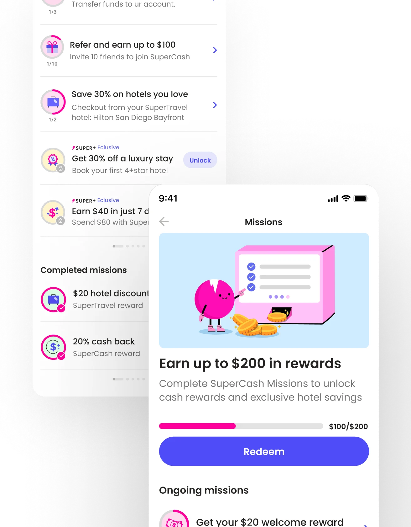
A single rewards hub to make Missions clear and actionable:
A shared rewards hub gave Missions one home across the product.
Locked rewards to create Super+ upsell opportunities:
Locked Missions turned the model into an upsell surface for Super+.


Timely notifications to re-engage users to complete Missions and earn.
Celebratory confirmation to reinforce earned success.
Step-by-step Missions guide users through core tasks:
Reusable mission flows adapted to referral, activation, and travel rewards.


CONCEPT TESTING
PowerUps improved attention, but not comprehension
The new label made rewards more noticeable, but not easier to understand.
The new label made rewards more noticeable, but not easier to understand.
It still did not make the payoff clear enough to drive confident action.
It still did not make the payoff clear enough to drive confident action.


The concept increased attention and gave rewards more presence in the flow.
The concept increased attention and gave rewards more presence in the flow.
The concept increased attention and gave rewards more presence in the flow.
To test the idea, I built an onboarding concept around PowerUps.
It made rewards feel more visible and gave stakeholders a sharper, more marketable story.
To test the idea, I built an onboarding concept around PowerUps. It made rewards feel more visible and gave stakeholders a sharper, more marketable story.
To test the idea, I built an onboarding concept around PowerUps.
It made rewards feel more visible and gave stakeholders a sharper, more marketable story.


“I’m still not sure what this gets me. Is it actual cash?”
“I’m still not sure what this gets me. Is it actual cash?”
“I’m still not sure what this gets me. Is it actual cash?”
Yet, users still had to decode value, progress, and next steps on their own.
Yet, users still had to decode value, progress, and next steps on their own.
Users exposed the remaining gap. The label was clearer, but the value was still vague.
PowerUps improved the packaging, not the payoff model. Users still needed clearer value and visible progress.
Users exposed the remaining gap. The label was clearer, but the value was still vague.
PowerUps improved the packaging, not the payoff model. Users still needed clearer value and visible progress.
A/B TESTING
Visible progress increased onboarding completion by 14%
Users were unsure how much effort earning a reward would take.
One pattern was clear: users could not connect effort, progress, and payoff.


“When I click the card, I expect to see how long it'll take me to earn it.”
“I expect to see how long it'll take me to earn it.”
“I expect to see how long it'll take me to earn it.”
User feedback improved movement, yet the reward system itself still needed to be simpler. Progress alone, didn't fix the model.
Making progress visible helped users understand where they were and what was left.
Making progress visible helped users understand where they were and what was left.
User feedback improved movement, yet the reward system itself still needed to be simpler. Progress alone, didn't fix the model.
User feedback improved movement, yet the reward system itself still needed to be simpler. Progress alone, didn't fix the model.
WORKSHOPS
We turned scattered rewards into one Missions model
One pattern was clear: users could not connect effort, progress, and payoff.
One pattern was clear: users could not connect effort, progress, and payoff.


We defined an MVP that PM and engineering could scale.
We defined an MVP that PM and engineering could scale.
I led the shift to Missions, shaping the structure and progress logic.
Those workshops shaped Missions into a single, task-based system teams could align on, explain, and scale.
I led the shift to Missions, shaping the structure and progress logic.
Those workshops shaped Missions into a single, task-based system teams could align on, explain, and scale.
I led the shift to Missions, shaping the structure and progress logic. Those workshops shaped Missions into a single, task-based system teams could align on, explain, and scale.
USABILITY TESTING
Missions made rewards tangible, guided, and easier to complete
Missions made rewards tangible, guided, and easier to complete
Users could act without decoding the reward first. The next step was built into the flow.
Users were unsure how much effort a reward would take. I tested clearer progress cues to reduce that uncertainty.

“Okay, I see. I unlock the reward once I finish these.”
“Okay, I see. I unlock the reward once I finish these.”
“Okay, I see. I unlock the reward once I finish these.”


Users could understand reward progress at a glance. The flow itself made the next step clear.
Users could understand reward progress at a glance. The flow itself made the next step clear.
IMPLEMENTATION
I scaled Missions into a system-wide rewards model
Once Missions proved clearer in onboarding, the next decision was whether the model could scale without breaking.
I worked with PM and engineering to extend one task, progress, and payoff model across activation, retention, and upsell.

A shared rewards hub gave Missions one home across the product.

Mission prompts brought key activation steps into the product at the right moment.


Daily Missions extended the model from onboarding into habit-building.


Locked Missions turned the model into an upsell surface for Super+.


Reusable mission flows adapted to referral, activation, and travel rewards.

KEY TAKEAWAYS
KEY TAKEAWAYS
What this taught me about clarity, alignment, and scale
What this taught me about clarity, alignment, and scale
1
1
Clearer reward models can beat bigger UI redesigns
Clearer reward models can beat bigger UI redesigns
Users moved faster once effort, progress, and payoff became easier to follow.
Users moved faster once effort, progress, and payoff became easier to follow.
2
2
Naming helped, but clear structure did the real work
Naming helped, but clear structure did the real work
Users responded once Missions made the next step and reward logic explicit.
Users responded once Missions made the next step and reward logic explicit.
3
3
Early alignment made the MVP easier to ship and scale
Early alignment made the MVP easier to ship and scale
Workshops helped unify our vision for the reward mechanics into one model.
Workshops helped unify our vision for the reward mechanics into one model.
Want the full story?
This case study is the high-level view. Happy to go deeper in conversation.
Want the full story?
This case study is the high-level view. Happy to go deeper in conversation.
Want the full story?
This case study is the high-level view. Happy to go deeper in conversation.
Want the full story?
This is a high-level view of the work. Happy to go deeper in conversation.
Up next


I scaled Missions into a system-wide rewards model
IMPLEMENTATION
Once Missions proved clearer in onboarding, the next decision was whether the model could scale without breaking.
I worked with PM and engineering to extend one task, progress, and payoff model across activation, retention, and upsell.
Mission prompts brought key activation steps into the product at the right moment.

A shared rewards hub gave Missions one home across the product.
Timely notifications to re-engage users to complete Missions and earn.
Celebratory confirmation to reinforce earned success.
Daily Missions extended the model from onboarding into habit-building.

Locked Missions turned the model into an upsell surface for Super+.

Step‑by‑step Missions to guide users to engage in core tasks with ease.
Reusable mission flows adapted to referral, activation, and travel rewards.
54
Impact
Role
Scope
35%
Increase in conversions
11%
Boost in reward engagement
5%+
Higher checkout completions
This project showcase reflects my work. Certain details were adjusted to honor confidentiality.
Super’s rewards UX confused users. Poor communication and unclear redemption stalled engagement. This led to fewer account linkings, less activity, and lower retention.
Super’s rewards looked valuable, but users struggled to understand, compare, and redeem them. I redesigned the rewards model into guided Missions that made rewards easier to understand and act on.
Poor communication and unclear redemption reduced engagement. This led to fewer account links, less activity, and lower retention.
IMPACT
35%
Boost in reward engagement
11%
Increase linked user accounts
5%+
Rise in reward completions
ROLE
Sr. Product Designer
Led the shift to a guided Mission model. Problem framing, UX strategy, writing, prototyping, MVP.
SCOPE
4 months
2 Product Managers, 3 engineers, 1 researcher. Onboarding, user activation, referral, travel rewards.
64%
35%
Boost in reward engagement
11%
Increase linked user accounts
5%+
Rise in reward completions
ROLE
Sr. Product Designer
Drove the shift to a guided Mission model. Problem framing, UX strategy, writing, prototyping, MVP.
SCOPE
4 months
2 Product Managers, 3 engineers, 1 researcher. Onboarding, activation, referral, travel rewards.

WORKSHOPS
We turned scattered rewards into one Missions model
One pattern was clear: users could not connect effort, progress, and payoff.
I led the shift to Missions, shaping the structure and progress logic.
Those workshops shaped Missions into a single, task-based system teams could align on, explain, and scale.
We defined an MVP that PM and engineering could scale.
MESSAGING EXPLORATION
One term reduced reward noise
A shared term made Super’s rewards easier to package and talk about.
I reviewed market reward patterns and proposed PowerUps as a shared term for Super’s mixed incentives.
The naming scan pointed to one clear move: package mixed incentives under a single, memorable term.
KEY TAKEAWAYS
What this taught
me about clarity, alignment, and scale
1
Clearer reward models can beat bigger UI redesigns
Users moved faster once effort, progress, and payoff became easier to follow.
2
Naming helped, but clear structure did the real work
Users responded once Missions made the next step and reward logic explicit.
3
Early alignment made the MVP easier to ship and scale
Workshops helped unify our vision for the reward mechanics into one model.
KEY TAKEAWAYS
What this taught me about clarity, alignment, and scale
1
Clearer reward models can beat bigger UI redesigns
Users moved faster once effort, progress, and payoff became easier to follow.
2
Naming helped, but clear structure did the real work
Users responded once Missions made the next step and reward logic explicit.
3
Early alignment made the MVP easier to ship and scale
Workshops helped unify our vision for the reward mechanics into one model.
COMPLEXITY
The problem wasn't only clarity, it was consistency at scale
Our new model had to work across onboarding, referral, travel rewards, and future incentives.
The reward system touched multiple surfaces, reward types, and business goals. Any fix had to stay clear for users and consistent enough to scale.
Unifying reward logic
Reward logic had to stay clear across onboarding, referral, travel, and future incentives.
Eliminating fragmentation
Reward types and entry points disjointed the experience. The model had to reduce variation.
The MVP had to stay simple enough to scale
The solution had to fit product and engineering constraints, using a reusable core pattern.